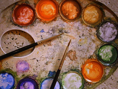
 From skin inking to silk painting, people have been using a number of techniques to ink with metallic pigments. Inking has been around for many centuries. Chinese from the 7th century on have made inking popular with their calligraphies and drawings of the natural world. The invention of inksticks was attributed to Tien-Lcheu, 2500 B. C. To use it, artists grounded a small piece of the stick and mixed with water. Ink was made with soot (from burning pine trees) mixed with animal glue (gelatin made from horns or hides) and sometimes incense or medicinal herbs such as clove or comfrey in order to preserve the sticks. Good ink came from the quality of the glue. Oil soot ink was mixed with pigments to create different colors. 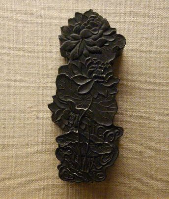 Inkstick in the shape of a lotus and hard as stone. By Sjschen - Own work, CC BY-SA 3.0, https://commons.wikimedia.org/w/index.php?curid=6277017 For two millennia ink was the major medium of painting. The art gained popularity in Japan and Korea as well. Gold leaves were added to some paintings. See below how to paint golden bamboo: In the 3rd millennium BC, another type of ink was invented. It was from iron, salt and ferrous sulfate mixed with tannin obtained from gull nuts. The oxidation created the ink. Read more about it here: https://irongallink.org/igi_indexd7ce.html Ancient civilizations have used mica in paints and pots in order to give a reflective shine to objects. Mica is nowadays used in cosmetics and paints to add glitter. Mayans used glittering paint. “Ancient Mayan temple builders discovered and used lustrous pigments to make their buildings dazzle in the daylight.” (See the article here: https://www.sciencealert.com/mayans-used-glittering-paints) Other cultures also inked, like Egyptians thousands of years ago. Egyptians preferred metallic inks. They added a varnish to conserve the paint. In Egypt, they burned organic materials to get coal, such as wood or oil, then they mixed it with a binder to allow the particles of coal to adhere/stick to the paper. The red color on ancient papyrus comes from iron oxide. Red was used for headlines. They made the famous Egyptian blue by “heating together quartz sand, copper, calcium oxide, and an alkali such as natron.” (Rachel Danzing) Nowadays, a metallic ink is a regular color mixed with a shiny material such as copper, aluminum, bronze or zinc or micca. Meredith Dillman used metallic watercolors mixed with acrylics to paints some of the most amazing fantasy characters. See below: See more Metallic paints with watercolor below: See a demonstration on Inking technique plus metallic watercolors below:
1 Comment
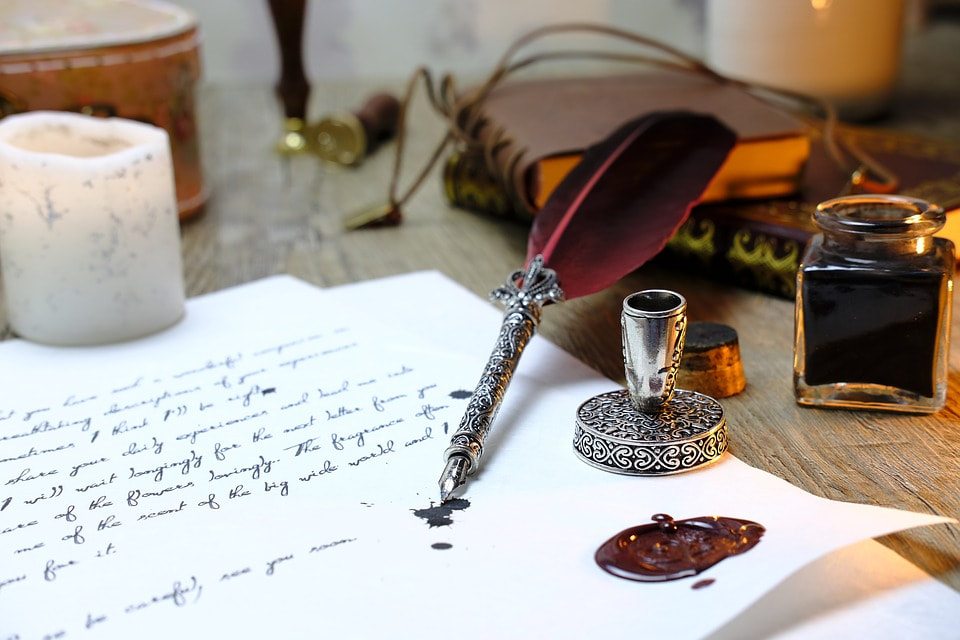 You might already know that acrylic painting doesn’t use true black. You never paint out of the black color tube. Instead, you mix up opposite colors on the color wheel in order to have control over your dark areas, making them cooler or warmer. Inking is the art of drawing with ink, sometimes from scratch, but also over fine sketch lines made with a red pencil. Inking uses true black contrary to the color painting techniques. But is it really true? While some illustrations techniques use overlapping colors and sometimes blurred contours, visual art using inking have clear and distinctive typically black contours. It’s because paints are meant to be used with brushes while inks are meant to be used with pens or quills. Inking is more akin to calligraphy and allows more details. Painting uses dots and washes. Inking uses dyes while painting uses pigments mixed with the medium used for painting. Dyes or shellac do not behave like acrylic or watercolor. While picture books seem to use mostly paints, illustrators are often asked to draw in black and white. Inking is a skill in demand and some artists are specialized in inking. Why inking? Inking requires the mastery of values. Inking requires an artist to control composition and viewpoint. Inking requires the perfect understanding of dark and light spaces, zones of contrast versus zones of less contrast. Finally, inking requires having a steady hand. That's a lot of skills! Sure inking is mostly linked to manga and comics books as well as graphic novels. Still, find examples of some popular inking picture books below. Beautifully Illustrated Black-And-White Picture Books https://www.goodreads.com/list/show/74975.Beautifully_Illustrated_Black_And_White_Picture_Books Inking doesn’t only use the art of hatching and cross-hatching lines and true black. Inking also uses diluted black ink to fill the grey areas and the shadows on the paper. Diluting black ink allows you to come up with diverse ink gradients. This way, you actually paint with your ink. See the tutorial from on how to sketch in ink and how to make ink gradients and bring more values into your drawings. True black (rich black) is always black in printing, but it can be swallowed by paper. Ah, thirsty paper! Do not underestimate the power of the paper! In printing or making a PDF file, black is not black, but charcoal or dark gray. Why, oh why? Because some of the paper absorbs the color and some of the white from the paper shows through the black ink. This is why when you print your design, it might look grey, not black. In professional Art software, you can set the preference to “Black accurately” when clicking on the setting "Appearance of Black". Rich black, in printing, is a mixture of black with other colors. A rich black might be 100% black, 60% cyan and 40% yellow. You get a warmer black by using more yellow. You get a cooler black by using more cyan. Just to let you know. Now that's you're more the wiser, go ink! Found a few tutorials for book defacing. Beautiful art, these techniques will inspire you to embellish the best books in your library. This week's diaries, using different techniques. 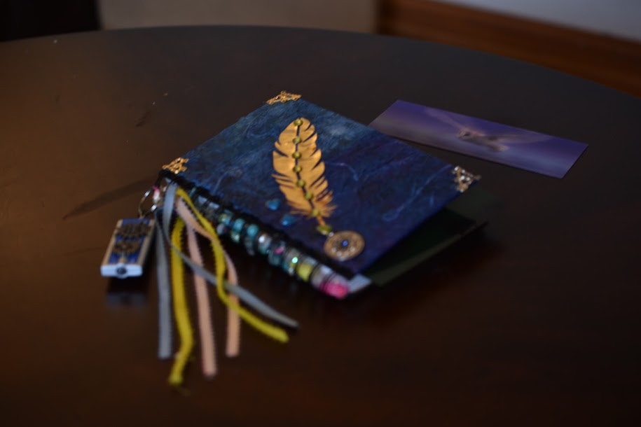 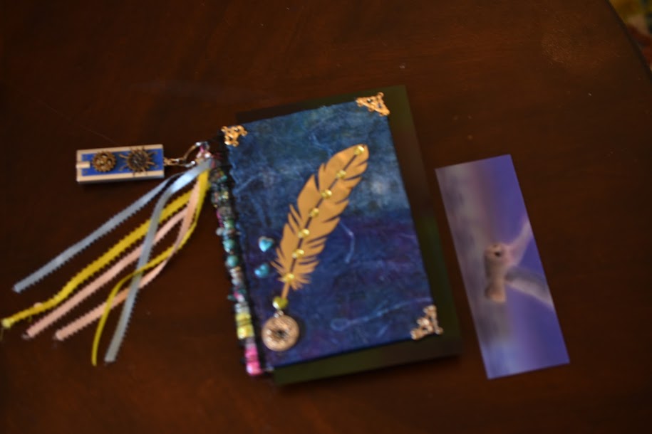 The theme was the flying owl. I used Japanese paper and wrinkling paper technique. Ornaments. Beads. Nail decoration bottles. A steampunk flashlight for night reading. 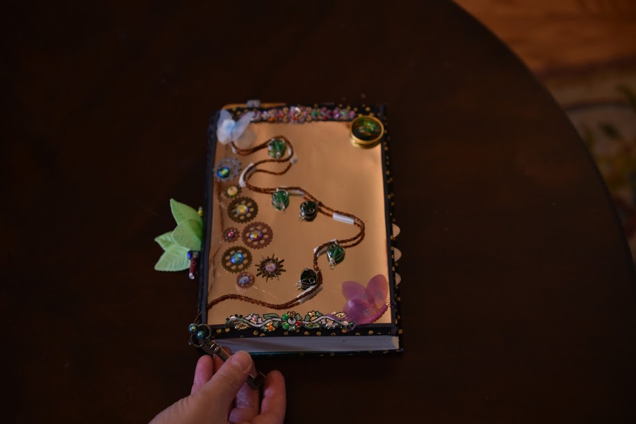 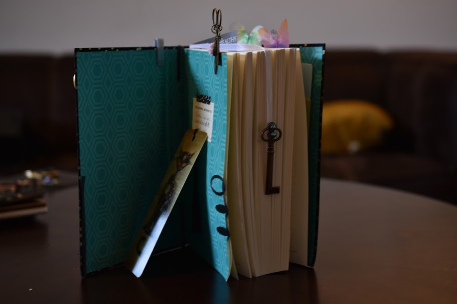 The theme here was gold and the reflection/mirroring of light. I used gold paper. Ornaments. A string of beads. clips on decorared with butterflies. Steampunk elements. I'm planning to work more on the inside pages. 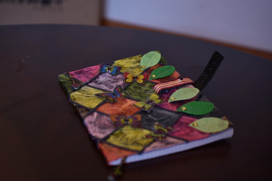 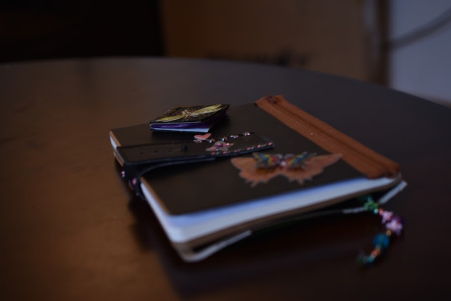 The theme here was flying away and voyage.
I used a decorated leather bracelet. Stickers. Beads. Japanese paper and soap leaves. Highly textured. 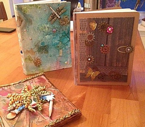 Here are some journal covers I made. I'm trying different techniques. Here is one made with stencils, inks, texture paste, mod podge, and some decorations. 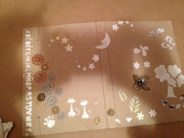 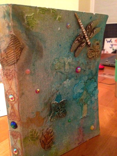 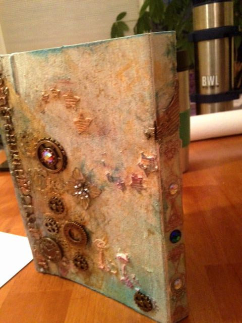 Here is another journal made with textures and some decorations. There are different magnets that can be moved around to keep notes and pictures. 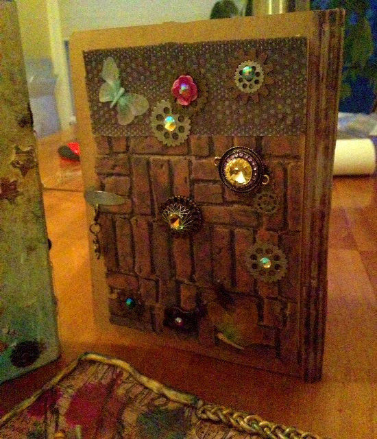 Another one made playing with clay. The pencil is not glued to the cover. It is trapped under the hand. This is my version of a writer-alien being sucked into a book. 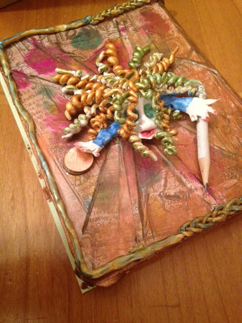 Will update on other techniques I'm using.
 Most African-American picture books are about feeling grand, having super powers, liking oneself and about looks. They often portray characters who need to feel better about themselves, who show how to accept oneself and how to be proud of who they are. Some African-American books are also about famous people and slavery. The books I read in the USA are so different from the books I have grown up with in France, a country with many African influences, especially since the colonial times. The African tales I read and was told about are populated with tales born in Africa and passed on from generation to generation. These tales hint at the folklore, the culture, the nature, the bravery of African people, the feats they have to overcome. Oftentimes the characters were brave, especially when they had to face witches and wild animals. Often the characters were wise and cunning. They also talked to trees, to animals, and to rivers. These tales were also filled with animal tales as in Africa each animal symbolises a quality. I also learned of the savanna, the desert, the fishermen and African villages, of healers, chiefs, and spriritual leaders, of communities and griots (the living libraries). These tales talked about cultures that live overseas. The African-American culture or sub-culture in the USA seems to rotate around basketball, beauty, slavery, music (jazz, rap) and dance (hip hops and its many derivatives). I'm sure there is more to it, but that's what picture books reflect. I have found a few books that defy the stereotypes. I enjoyed the ones that I expected to find too and had to admit they talk about subjects African-American worry about and we need to give respect to those great artists. I hope you enjoy my list. I gave links on youtube for some. Visit the links and read the books along, buy the books to encourage their writers and artists , or visit your library, but do not ignore them. 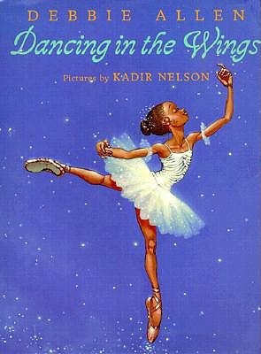 Funny story with funny pictures about a girl who is sassy, has big feet and big legs, and wants to learn ballet. She ignores everyone’s snickering and decides to steal the show. This sassy girl takes her physical handicaps, and make them work for her. It should be an inspiration to anyone. Written by Debbie Allen (http://www.debbieallendanceacademy.com/ ) Illustrated by Kadir Nelson (http://www.kadirnelson.com/ ) 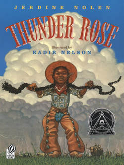 Tall tale that gives back to power to little girls and a minority. African-Americans pictured as cowboys? Unique. Amazing. A child “with the power of thunder and lightning”, Rose names herself, rides a bull, and is some kind of super hero. Written by Jerdine Nollen (http://www.jerdinenolen.com/) Illustrated by Kadir Nelson (http://www.kadirnelson.com/) 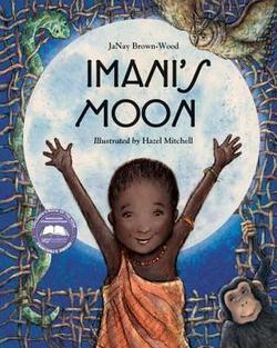 Imani's Moon by Janay Brown is a wonderful story about a child who wants to reach the moon. This Masai girl who lives in Africa learns that no dream is too big and even someone small can reach big goals. Beautiful drawings helps to tell the magical realistic tale. Written by JaNay Brown-Wood (http://www.janaybrownwood.com/) Illustrated by Hazel Mitchell (http://www.hazelmitchell.com/) 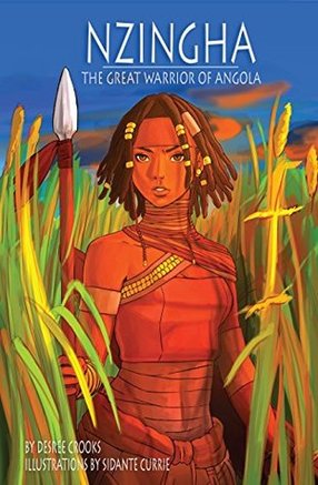 Watch some episodes online (see below). There is a chapter book and a journal. The chapter book is here: Nzingha the Great Warrior Queen of Angola is beautifully told with engaging pictures and so much to learn about Africa. Buy here: (https://www.nzuribooks.com/shop/) The journal (which is another book) portrays the thirteen-year-old African warrior, Nzingha, who lived in the 16th-century. She was a West African princess who loved to hunt. Nzhingha, Warrior Queen of Matamba, Angola, Africa, 1595 by Patricia C. McKissack. 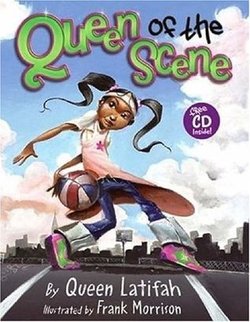 She’s got game and no one can stop her. The queen of the scene is a celebration of confidence no matter what. The drawings in this picture book successfully show vibrant action with focus on parts of the body like the feet or the long legs. In fact, arms and legs stretch far to make her stand out. The queen of the scene always walks chin up. She can appear taller than she really is. The book uses rhythm, rhyme, and repetitions in a way to reinforce the concept. It comes with a CD recording of Queen Latifah rapping the book. Written by Queen Latifah (https://www.queenlatifah.com/) Illustrated by Frank Morrison (https://morrisongraphics.com/) I just love the way the narrator reads this story.
No one could have read it better, honeslty. High fives. One more thing about all these books that's really cool. All of them were written and illustrated by talented African-Americans. If you want to find more African-American books, Pam Margolis is sharing many more links on her blog, at: An Unconventional Librarian: http://unconventionallibrarian.com/ Enjoy! 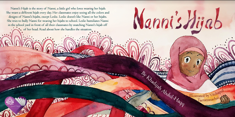 Nanni’s Hijab, written by Khadijah Abdul-Haqq and illustrated by Vitchapol Taerattanachai is one of the most beautiful Islamic books I have come across. SUMMARY: Nanni is quite the attraction at school with her beautiful hijabs, so it doesn't come as a surprise when one of her classmates is unappreciative. It is hard for new kids to see all the attention drawn to someone else because, after all, being new should be something that gets people's attention. Soon, the new classmate, Leslie, tries to bully Nanni, but instead of retaliating, Nanni finds a smart way to solve the issue. And it’s truly inspiring. CRITIQUE: First, the illustrations will enchant children with full watercolor drawings that embrace the whole page. The expressions on the faces of the characters are vivid and get right through your heart. The soft pastel colors seize the innocence of youth. And the range of characters hints at a new generation of children books that take into consideration the diversity of the world. That’s very exciting. The story is well-written with lyrical prose. The plot is relatable and will touch every Muslim child with its dynamics and realism. Plus, the story has a great twist at the end, one you would never imagine. Nanni’s Hijab is a jewel that teaches patience and how to be smart in the face of adversity. It will be an inspiration for decades to come. This PB mixes modern manga characters with traditional paintings that made many children books famous. It illustrates how some tropes (manga expresssion and composition) can be successfully integrated into PB to give us a sense of familiarity and renewal. 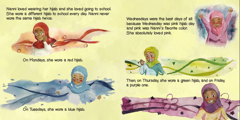 See how the theme color is used for each day of the week. The scarves are used as background of the picture and the beauty of it seems to wrap all around the character in a dream-like effect of gauze. The neutral background helps with the magic contrast. 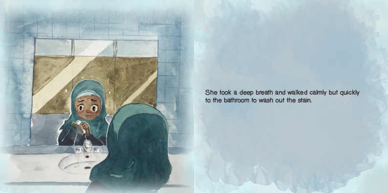 Look at the harmony between color of background and color of hijab to put the emphasis on the facial expression. Look at the reflection in the mirror that frames the face. This picture is heart wrenching, but at the same time shows how lonelythe character feels. This PB shows the great use of bleed. Title: Nanni’s Hijab Author: Khadijah AbdulHaqq Publisher: Djarabi Kitabs Publishing Published on: 31st January, 2018 Format: Paperback & Ebook Age Group: 6 to 12 years Pages: 36 Buy the book here: https://www.djarabikitabs.com/bookstore/nannis-hijab Note!
Thanks to the publisher for allowing me to publish these spreads. I am extremely grateful. These pictures are protected by copyrights. Misappropriation is strictly prohibited. Thanks for your understanding. Movement is essential to storybooks. Characters are not static, but move and express something, especially feelings or situations. The best way to show movement is to us flowing gestures and character being swept away. Here, see how the pattern of the butterflies following a curve to the far distance reflect a movement. The butterfly to the far left are smaller than the ones in the front and toward the right side; that is intended to show the distance and therfore movement or depth in space. Notice that the individual drawings do not all reflect the same position for the wings. There is diversity in order to show different butterflies "photographed" at their own speed, doing their own thing as they all follow their leader. 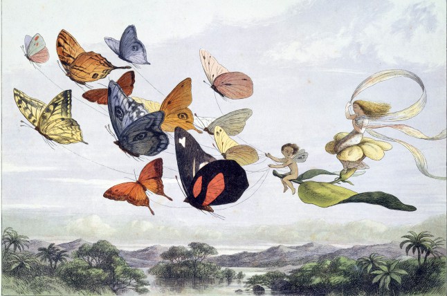 Richard Doyle’s "In Fairyland". Courtesy of https://freevintageillustrations.com/ The picture below has it all. It has the semi-circles and circles that promote and highlight the sweetness of the image. It has patterns (the spiderweb and the people forming a queue). The movement (each character is moving or waving and doing something unique) 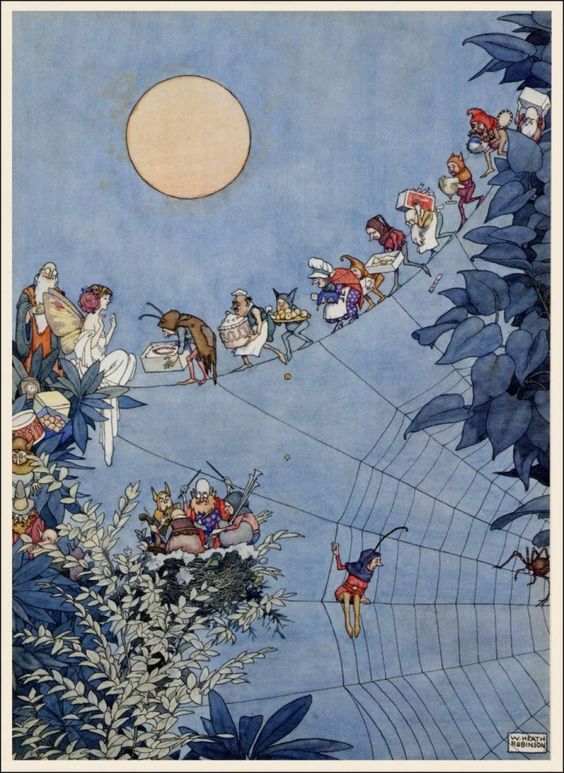 Public domain illustration by William heath Robinson. Courtesy of https://freevintageillustrations.com 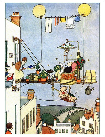 Public domain illustration by William heath Robinson. The beauty of a picture book drawing is its patterns. You will notice the repetitions of the same shapes. Look at the bonnets and the houses in the first picture. It almost feels like the houses are wearign bonnets too. Look at the dresses. Look at the dots on the gound. Even the movements of the kids seem to be a pattern. 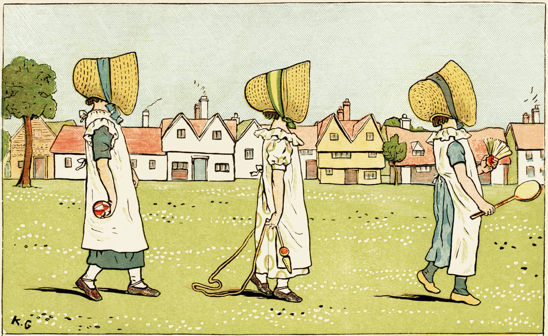 Kate Greenaway (1846-1901). Public domain. Thanks to http://www.reusableart.com Notice the movement of the drawing and how harmonious it is. Everyone is following the same line that describes a curve (see Picture Books Composition 1). The kids are mostly walking by ranks of two. Their slim and straight bodies reproduce the pattern on the fence and the straight lines of the houses and schoolhouse. If you had to draw a rough draft of the image, you would have a lot of sticks. 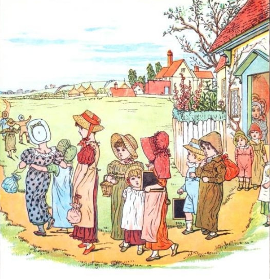 "Under the Window" by Kate Greenaway (1879). Public domain. 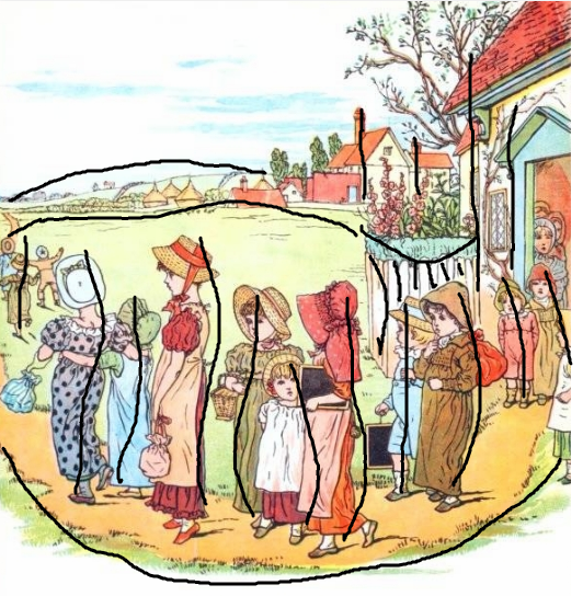 As I grow better at illustrating my books, I have noticed a few things. Here are a few tricks I got from studying picture books: Picture books are made with a lot of round curves. Actually, you could mostly draw with semi circles and circles. Look at the shape of the clothes, the castle, the river. If you had to make a rough draft of this picture, you would have mostly half circles and triangles. Look at the picture underneath. The shape of the dresses, the mirrors, the objects that touch the floor all follow a rounded curve. The younger the kids, the better they tend to respond to plump faces and round hills. That's because curved and circular lines evole security, warmth, coziness and so very-well adapted to a safe, uplifting, enjoyable picture book made for very small kids. 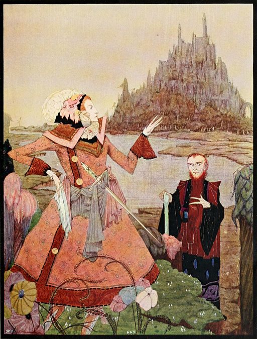 Illustration from Fairy tales of Charles Perrault (Clarke, 1922). Wikipedia Commons. 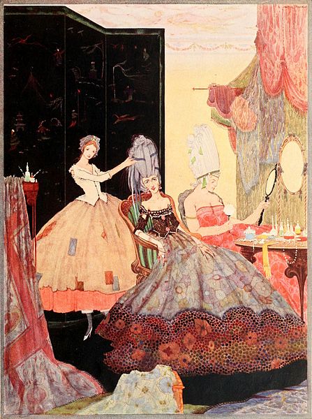 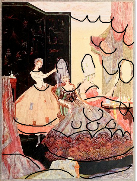 Look at the strong curves in the illustration below. The coat is an oval. The path of the birds take is a zigzag. The stars follow a serpentine path. The wings of the biggest birds are curved downward and upward. Soft lines with curves are often linked to organic and natural objects. Think of the birds and the flowers on the ground. 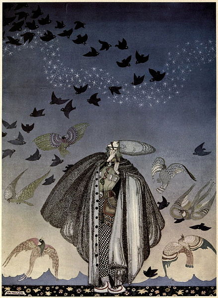 “East of the Sun and West of the Moon” (1914), Illustrations by Kay Nielsen. Wikipedia Commons. |
February 2019
In 2015, 2016 & 2017
In 2016 & 2017
Illustrator
I am Sussu Leclerc and I started writing and illustrating picture books thanks to the Smart Dummies event hosted on Facebook by amazing Dani Duck. Archives
October 2018
Categories |
 RSS Feed
